Ugly Websites Make for Beautiful Results: 4 Tips to Increase Your Conversions

Anything beautiful can be distracting. This is true when it comes to websites. Think about a beautiful website you’ve been to. There was probably lots of white space, a cool video automatically playing at the top of the home page in the background, and then when you start to scroll you saw overlapping images and text that is visually appealing to the eye.
These things are fun but think as if you’re a prospective lead. Have those things addressed any of your concerns or answered any of your questions? It’s more likely they’ve just distracted you. These elements on a website have proven to distract visitors from turning into a lead.
At the end of the day, as a business owner, you want your website to be your best admissions rep, CSR, or salesperson. It’s leads that matter, not an aesthetically pleasing website you can brag to your friends about or hold over the heads of your competitors down the street. Businesses should care less about the aesthetics of their website and landing pages and more about how many leads they produce.
To optimize your website for conversions, you can use a practice called conversion rate optimization (CRO). Effective CRO can help you understand what is distracting visitors from converting, as well as help you understand how other basic changes can increase leads.
What Is CRO?
CRO is the science of making educated changes to your website based on conversion-optimized practices. That might mean moving buttons around, changing forms, and even switching up colors and copy on the page.
When changes are made to the site, a split test is run to see which version converts best. CRO is heavily based in data, but it is not an exact science because each business has a different demographic, and that means users react differently.
If you’d like to learn more about what CRO is, click here.
4 Things You Can Do to Help Your Website Convert
1. Make Your Button and Form Awkwardly Stand Out
If your form and CTA button look awkward, then something’s going right! You want users to notice it. Make sure the buttons on the page/website contrast your brand colors. It might feel weird to pick a color that is slightly out of your branding color palette or choosing your detail color, but that’s what will draw attention to it.
Pay attention to what you’re asking people to do on the form. Eliminating form fields typically increases conversions. The less information you ask people to give, the more likely they are to fill out the form. Asking too many questions intimidates and overwhelms users.
By giving users the option to select what information they’re going to get, you allow them to feel like they’re choosing. It feels good to have the option to choose what you want, rather than someone or something choosing for you.
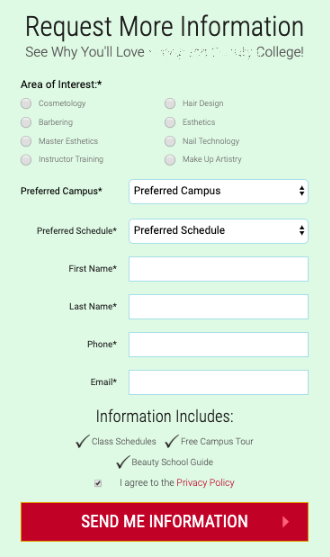
Even creating/testing a multistep form has been known to increase conversion rates. Below is a good example of a form from a beauty school. This meets most CRO form best practices and elements we’ve tested. We’ve worked with hundreds of beauty schools of the years, and we’ve built almost as many beauty school websites. The time we’ve spent optimizing pages and forms has taught us that forms like this convert best in any market.
The button could use an exclamation point, but other than that, it’s better than most beauty school forms where the button says “SUBMIT”. Buttons that don’t indicate what is going to happen once the form is completed are confusing and don’t tell users what to expect. Would you rather be caught by surprise when someone calls you regarding the form you filled out or would you rather be anxiously waiting by the phone and checking your email because you know they’re sending info? In addition to the copy, the button’s color is optimized. The red draws the eye to the button, and it makes it stand out against the school’s color palette on the rest of the page.
This form also gives the user the option to select to receive info on the program of interest, that gives users the power of choice.
A small, and what may seem like an insignificant part of this form, shows that the school does have a privacy policy, and it’s linked. Having a privacy policy, and linking it, increases the chances of conversion. (It’s also illegal if you don’t link it in a conspicuous place!) You may also notice that the school tells the future student what info they’ll be getting. Most website beauty school forms say, “REQUEST INFO” but as a user, you don’t actually know what you’ll be getting!
2. Be Involved In Writing Your Own Content
Writing content can be painful and time consuming for the average person, but don’t let this deter you as the owner or director from being involved in the content process. You should trust your marketing company to write your content but they are not the expert in your business; you are! You shouldn’t expect your marketing company to know everything about your business like you do. At the very least, you need to let yourself be interviewed by the person writing your content so they capture your voice and those tid bits that only you know will resonate with students and parents. Content not only includes text, but it also encompasses images and videos.
You don’t need to be the only content writer for your business. In fact, you don’t have to write the content at all. You need to be involved. There’s a science to writing content that a marketing company will know and you should let them help. Here are a few things they can bring to the table to make your content better:
- Search engine optimization (SEO)
- Calls to action optimization (CTAs)
- Audience targeting
- Conversion optimization
- Emotional connection
- Story telling
- Urgency
Content can make one of the largest impacts on conversions when it comes to getting more leads from your website. Take this part seriously! Marketing for beauty schools is our forte. We’ve been helping schools craft their stories and connect with their ideal students for years. Here are a few tips we always give when writing content for beauty school websites:
- The focus of the content should be geared toward the prospective students.
- Address the top five concerns students have about going to beauty school on your home page.
- Breakup the content into small paragraphs, and use bullet points.
- Be obvious. We found that by adding the word “cosmetology” to a page’s headline helped the page see a 66.67% lift in conversions!
3. Have Clear Calls to Action (CTA)
You need to find a balance between giving users all the information they want, while cutting out the noise to give a clear path to conversion. A good measure of this is to show your friend the site, and ask what the main call to action is. You should also let that same friend stand five feet from the screen and see if they can clearly read what the CTA is. Some schools prefer calls over form submissions. If this is you, make sure your phone number is more prominent. If you like form leads, is the form prominent and above the fold? It’s easy to get used to your own website structure and not realize how difficult it is to convert.
One thing we often see is secondary calls to action overshadowing the main call to action. Don’t let this happen. In the past, we had a school come to us for website optimization help and the first thing we did is suggest they remove a second form on their homepage for salon appointments. After doing this, and implementing some CRO best practices on the form, the school saw an additional 54 leads per month from their home page!
4. Be Mobile First
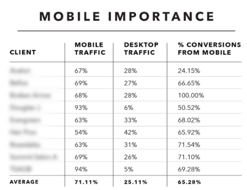
Design your site with mobile in mind first. For beauty schools, the majority of the traffic is from those on their phones. Below shows a list of several beauty schools and the difference of mobile vs. desktop traffic, plus the percentage of conversions from mobile. Overall, beauty schools are getting 65% and above of their leads from mobile devices.
Here are two quick factors that lead to a good mobile experience that you need to pay attention to:
- Load time
- Text readability
A one second delay reduces conversions by 7% (Neil Patel 2018).
– A slow website could be slow hosting, unnecessarily large images, too many requests, or a bad server configuration.
– This might actually make the biggest impact in improving conversion rates out of anything you can do to your website. It’s also a huge SEO benefit of having a fast loading website.
Ask yourself: how easy is it to read the text? Do you have contrasting colors and sizes?
– Text should be large enough to read and contrast against the background.
In The End…
There’s an old saying, “A bird in the hand is worth two in the bush.” This is true with websites. The bird in your hand is your current traffic, and you need to make sure you’re doing everything you can to convert these people, before you pay for more traffic. It will have a larger impact on generating more leads to do CRO with your website than it would be to pay for more traffic in hopes to get more leads that way. In many cases, you’d be wasting your money driving prospective students to a site that doesn’t convert very well.
Ready to Increase Your Leads?
If you’re not very happy with how your site is converting, or you’d like to find out how your site stacks up, we can perform a CRO analysis. It’s free and if anything, we’ll give you some good advice to ugly up your site!


