Graphic Design Trends For 2019
As one year ends and another begins, the Oozle Media graphic design team is looking at what’s new, what’s making a comeback, and what has staying power from the previous year, all with the goal of staying fresh and innovative. We are seeing design take some creative directions in the year 2019.
As the digital marketing world continues to evolve and change, we are seeing how important it is to stand out visually. It is becoming increasingly more important for businesses to hone in on their brand and to be clear on their vision and how they will appeal to their target market. More and more companies are making the design function a central part of their business.
Whether you’re a designer or are working with one, you need to stay on top of the latest graphic design trends. No matter the medium, understanding how styles are changing and evolving keeps your work fresh and resonate with clients. In 2019, you can expect to see plenty of digital and graphic design elements with vivid colors, bold design and asymmetrical composition.
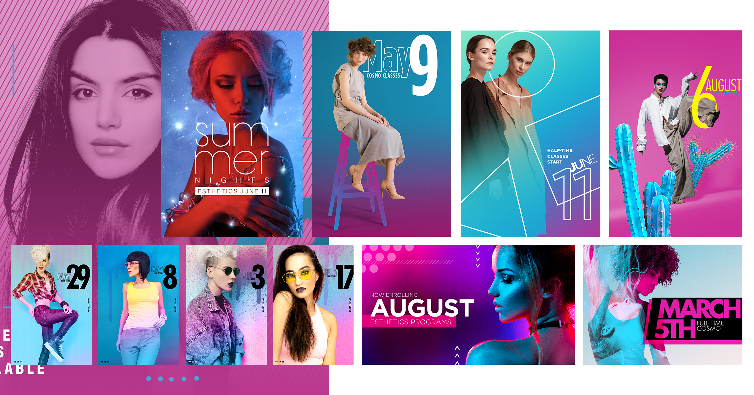
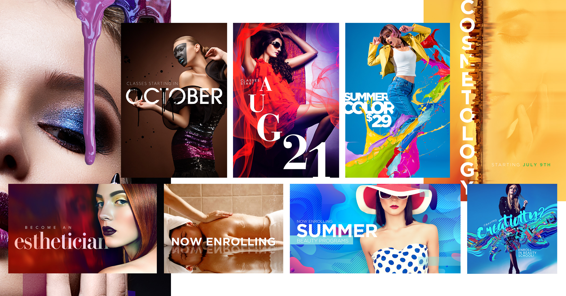
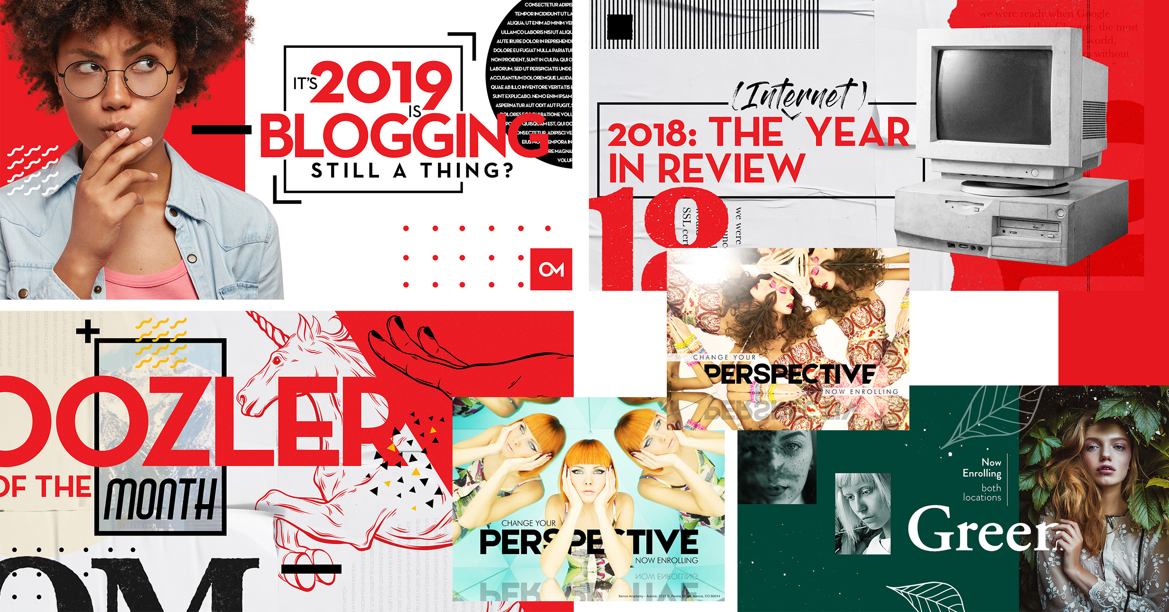
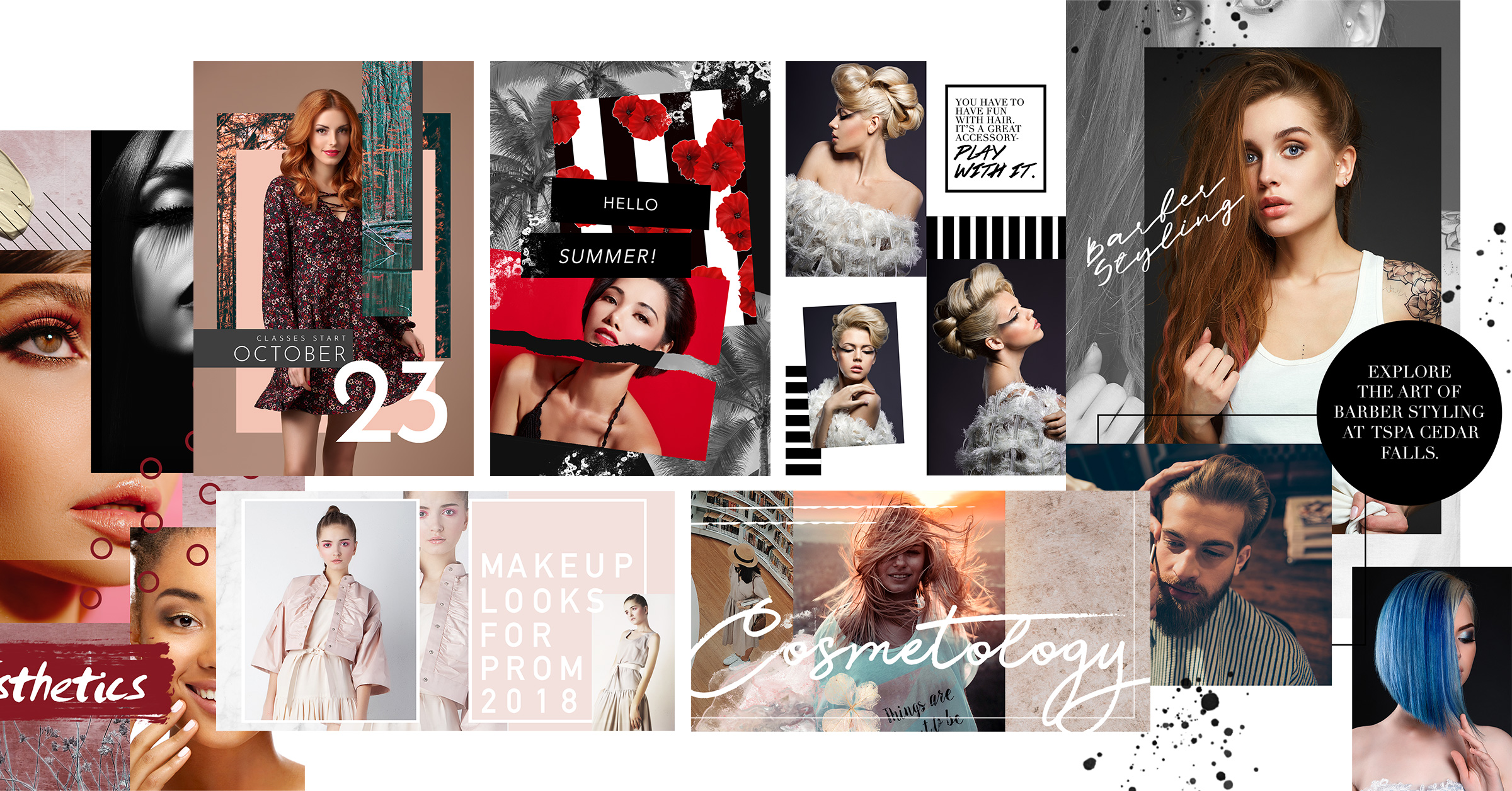
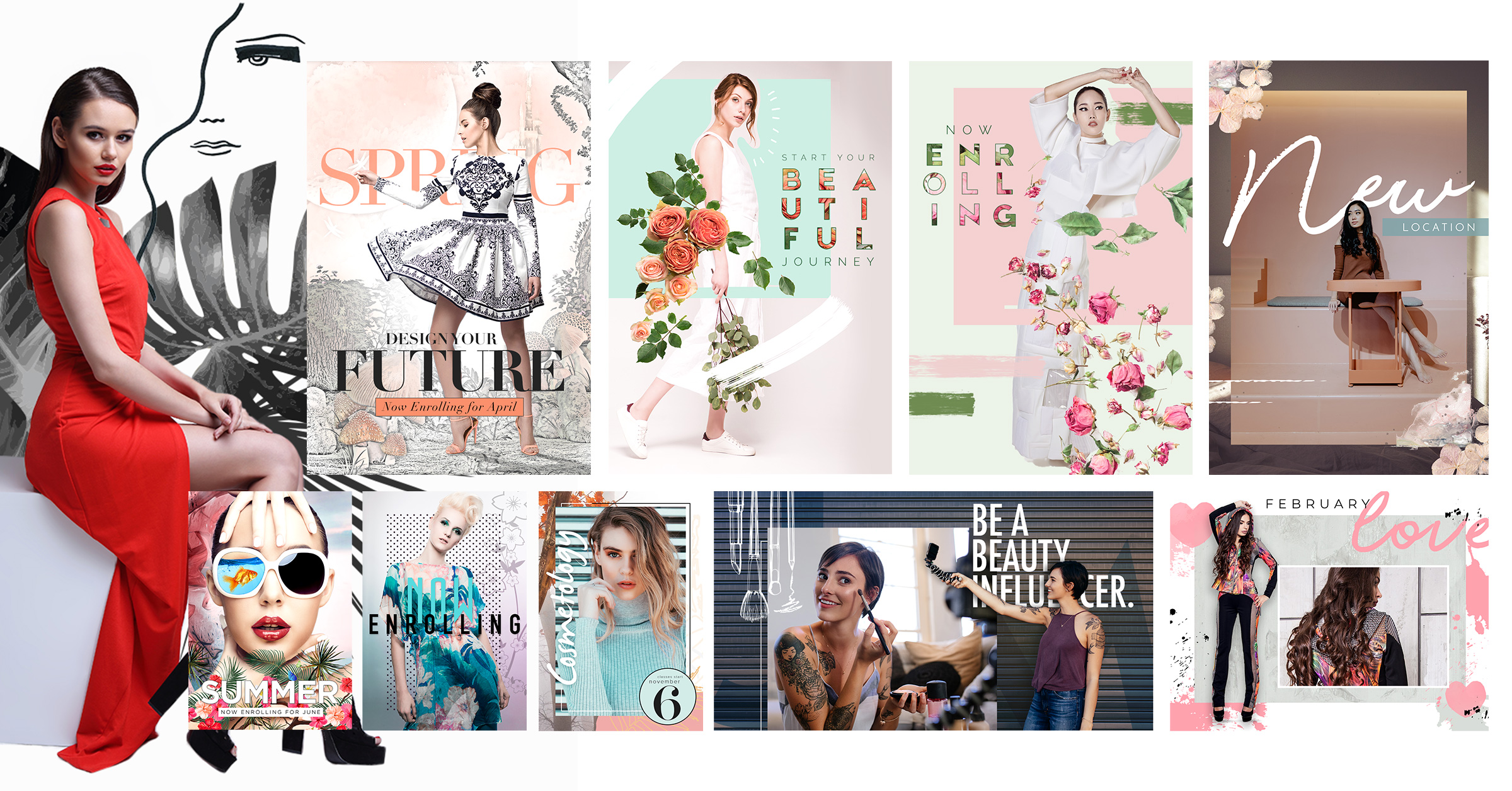
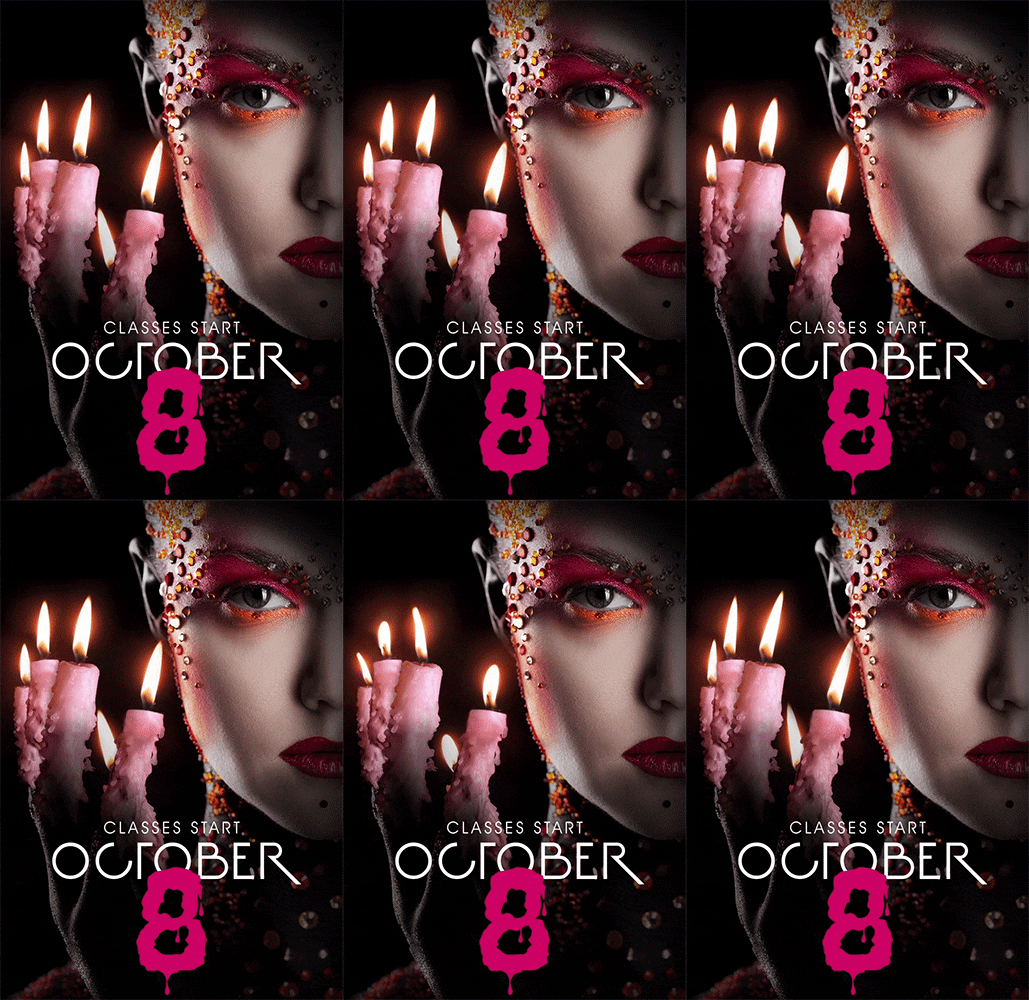
Take a look at our top picks for this year and start imagining how these trends can help inform your style. As always, we want to show you what we have been up to. All featured designs in this blog are ACTUAL client work created by our talented design team.
Also, see our list for 7 Logo Trends That’ll Define 2019
Here is our list for 2019
- Deep Flat
- Vivid Colors, Subtle Gradients, and Duotones
- Fluid Liquid
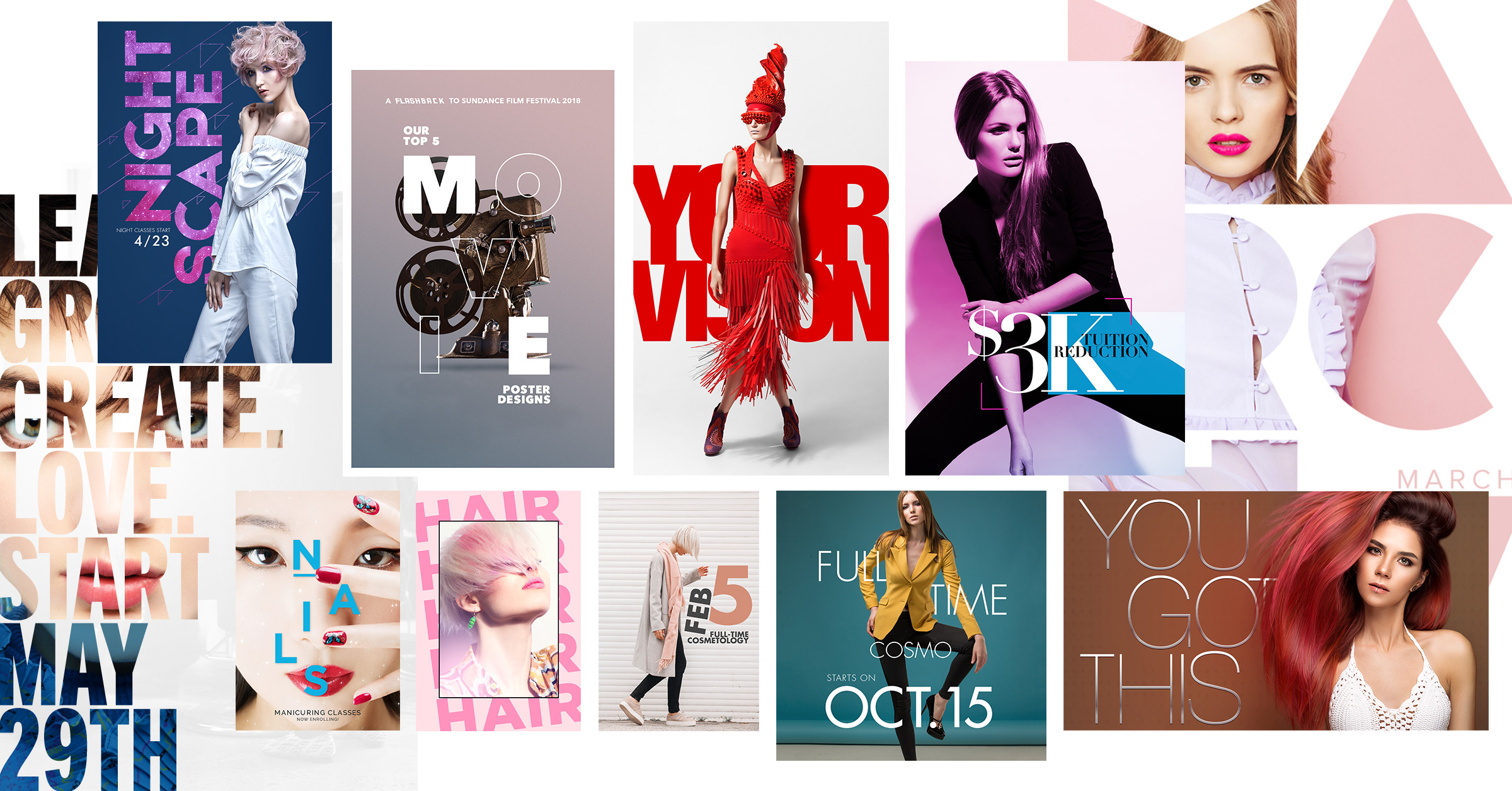
- Max Typography
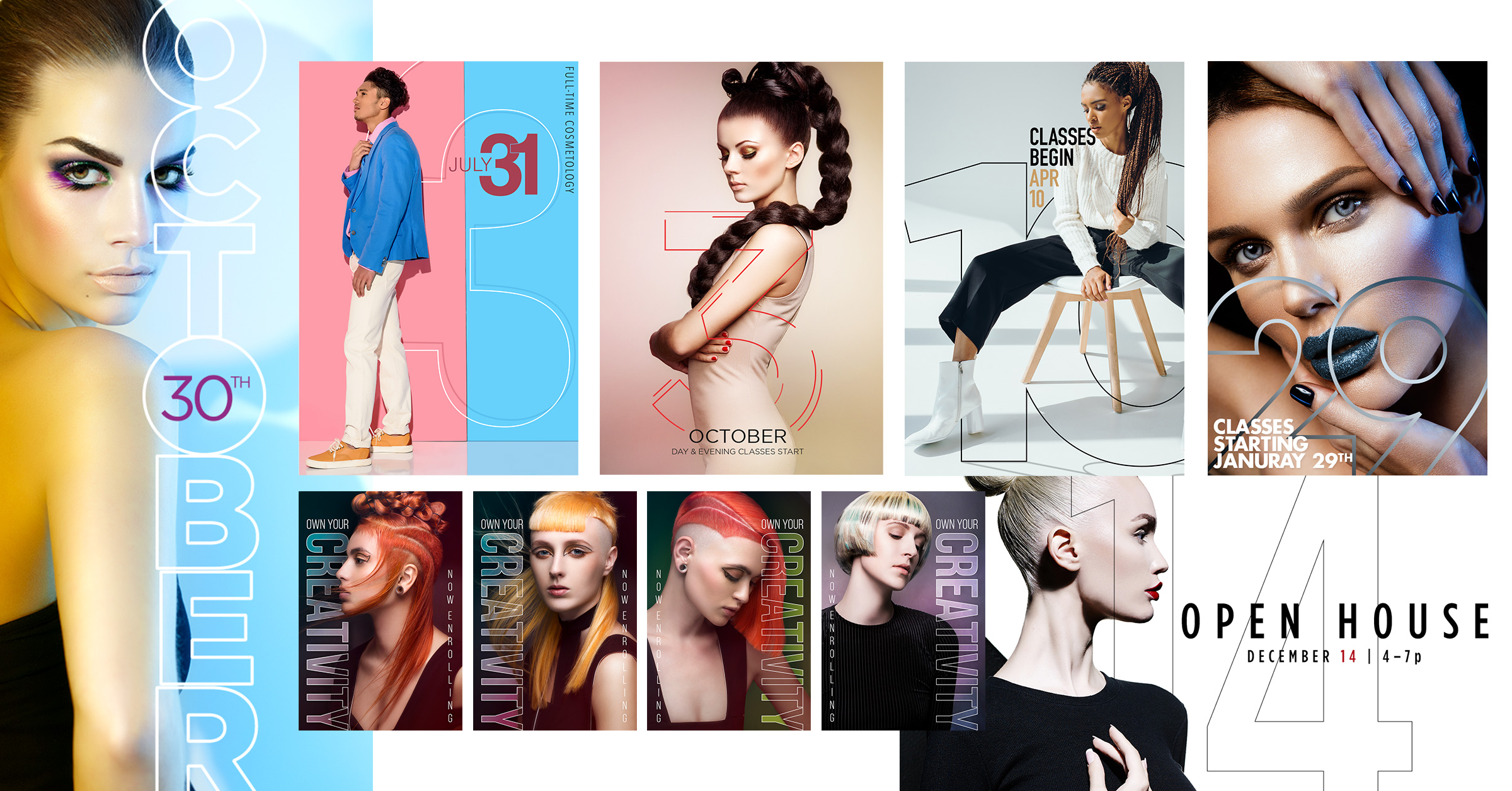
- Typography Outlines
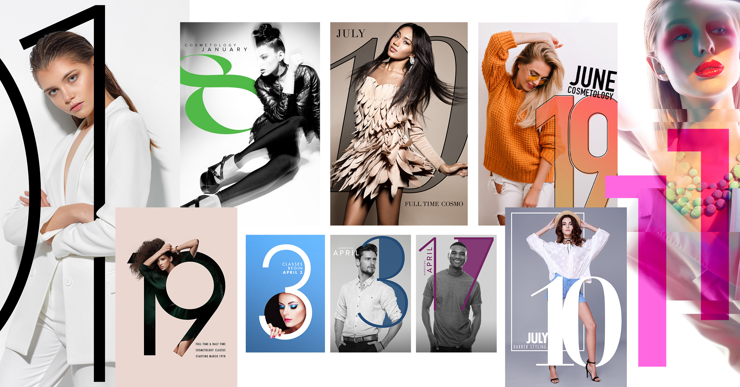
- Big Numbers
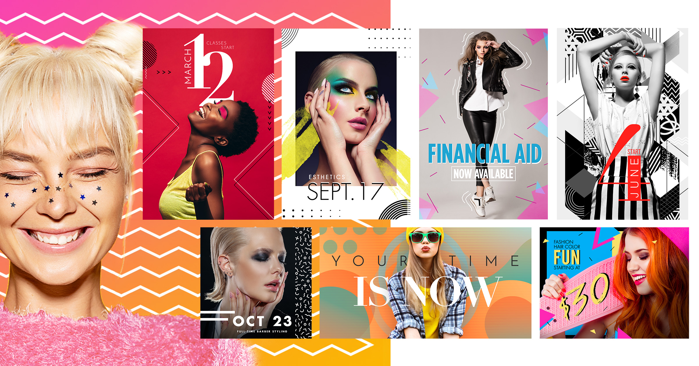
- Strokes, Shapes, Spots, and Doodles
- Open Compositions
- Asymmetrical/Broken Grid Layouts
- Modern Collage
- Simple Animation
- Natural Looking Photography
DEEP FLAT
We’re seeing the continued evolution of flat design to include some depth. The design retains the simple, minimalist vibe while including some enhancements to add dimension and improve usability. Adding a little bit of shadowing will help give your graphic elements a deeper feel and dimension.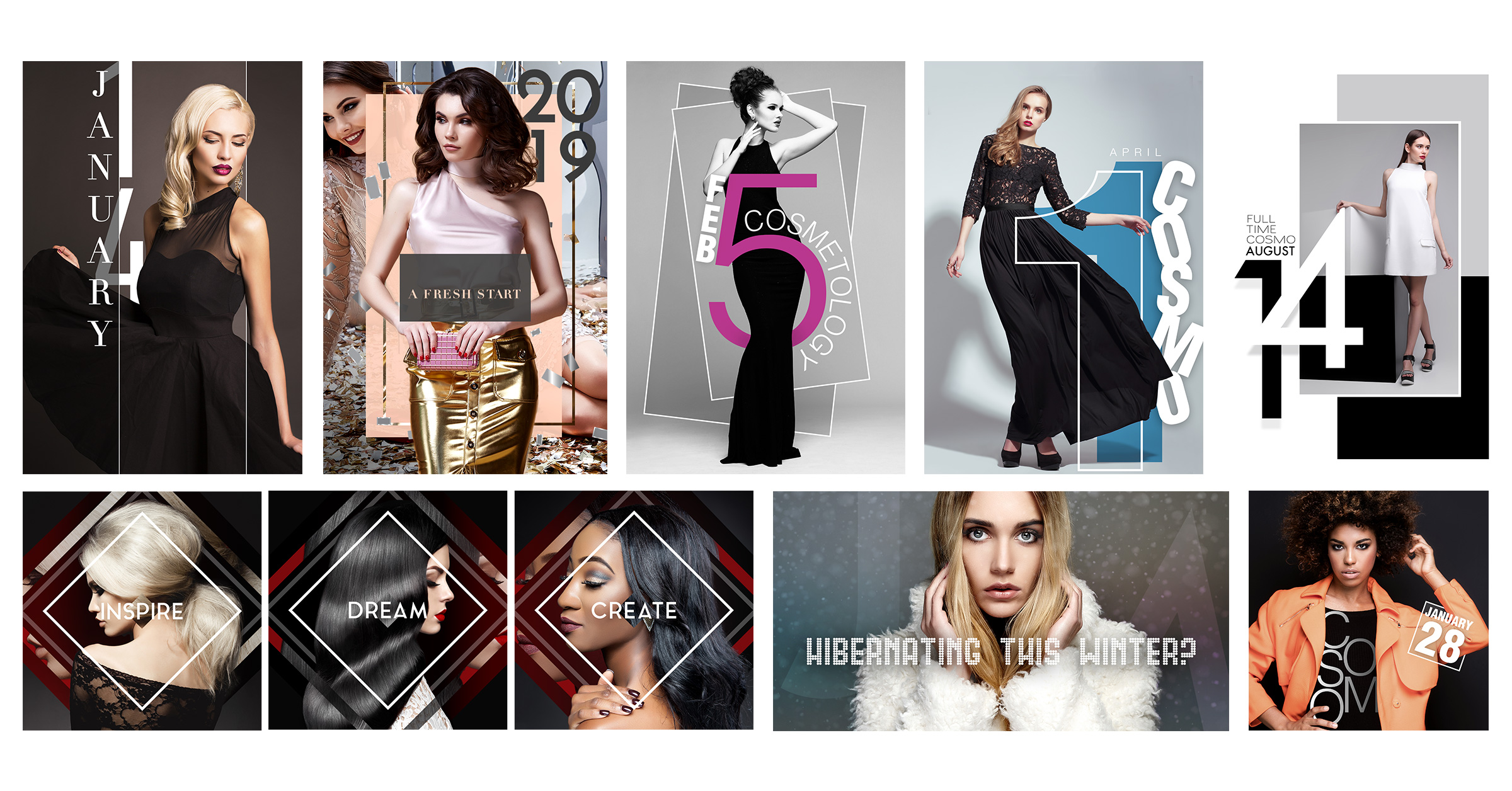
VIVID COLORS, SUBTLE GRADIENTS, AND DUOTONES
The bolder the better this year. Combinations of vivid neon colors combined with gradients were big graphic design trends in 2018, and we will continue to see this trend grow in 2019.
Simple one-color designs aren’t enough; more and more are showing up with eye-catching and attention-grabbing vibrant color transitions to elevate designs. Look for extreme contrasts in colors and tones, as well as complex gradients with more colors and varied transitions.
Using vivid “futuristic” colors to create mesmerizing out-of-this-world designs really taps into the designer’s imagination and provides a lot of room for improvisation.
FLUID LIQUID
Swirls, drips, and streaks — a gentle flowing design can imply fun or relaxation. Designers are merging their designs with liquid or fluid effects to create visually interesting textures that can turn an otherwise generic-looking design into something more dramatic.
The key with fluid effects like any other trend is to consider whether or not it fits your brand.
With liquids there are varying states and thickness levels, giving a designer infinite possibilities to their compositions. If you’re looking to add flair to your brand, patterns inspired by liquids can be unique and dynamic.
MAX TYPOGRAPHY
Typography as an inseparable part of graphic design definitely follows certain trends. We’re seeing a few typography trends in 2019. The idea behind maximum typography is to create strong focal points with text. In pursuit of more impactful graphic designs, we expect to see creative pieces in which typography is an active part of the design, interacting with real life objects and people.
Combinations of different font weights and density values, combinations between vertical, diagonal, and horizontal orientation, and even messy typography looks will be the norm in 2019. Look for orientation to play a part, too — vertical and horizontal will be joined by diagonal and scattered.
TYPOGRAPHY OUTLINES
While other outline elements seem to have gone out of style, outline typography is becoming more and more popular. Often interacting with other elements in the composition, we expect that it will be used a lot in 2019.
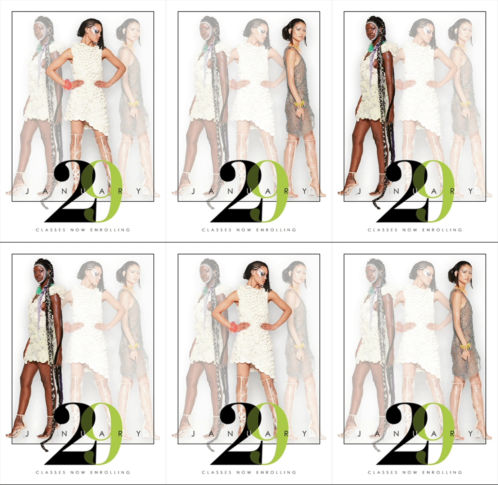
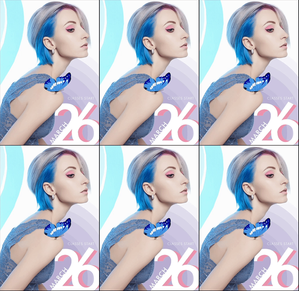
BIG NUMBERS
Following along with the trends in typography, this year we will continue to see how designers find impactful ways of bringing data and information to our attention through the use of numbers. This can be a literal translation to represent dates or stats. The use of numbers can also be used as an abstract concept where the numbers don’t actually mean anything but are striking visual elements added for effect or tone.
STROKES, SHAPES, SPOTS, AND DOODLES
One trend that we are seeing and love is adding spots and doodles! It’s a nod to some of the pop art of the 1980’s without being so overpoweringly 80’s. Combining spots and doodles with photography can create a playful look that enhances the more realistic images.
Alternative or freestyle illustrations and doodles are definitely fun to look at. Adding chaotic strokes, stains of color, and shapes will create an artsy looking offbeat design that makes the piece stand out.
Adding these elements to your design along with real-life objects or images will bring a new dimension to your artwork.
OPEN COMPOSITIONS
Are you ready to think outside the box? For years designers have put frames around design elements, encasing them in a strict order. In 2019 designers will vie for open, airy designs which seem to show only a part of the whole “picture.”
Designers can play with the composition to make each part look like it’s continuing off the page to infinity. This can allow the viewer to better engage with your image, allowing them to use their imagination and wonder what else is there. In a world where people are constantly inundated with information, creating something that gets the viewer to stop scrolling for a moment can make a huge difference in your marketing campaign.
This trend is easily done in web design but can also be achieved in print or digital design.
ASYMMETRICAL/BROKEN GRID LAYOUTS
This broken grid trend is inspiring a lot of designers. It’s been described as “thoughtful disarray,” and it relies on asymmetry for its unique look.
This trend may throw designers for a loop as we have been taught the power of following the “rule of thirds” and designing in carefully constructed grids. This trend allows the designer to go off the “grid” to create more of a living, moving feel. More importantly for business, it creates a custom-made look, giving smaller, lesser-known brands a way to stand out.
While there is beauty in chaos, it is important that you take to heart the term, “thoughtful disarray.” Don’t forget your brand and make sure all elements allow the viewer to remember who you are.
MODERN COLLAGE
Blending distinct mediums like photos and vectors to create montages of digital clippings. Combining elements of the real-world mixed with illustration.
A trend closely related to the strokes, stains, spots, and doodles above is the modern collage, which combines photos, vector graphics, and other images. What is great about these combinations is the way they define “collage,” taking it from something like a digital representation of a scrapbook and letting you experiment with more surreal design.
SIMPLE ANIMATION OR CINEMAGRAPHS
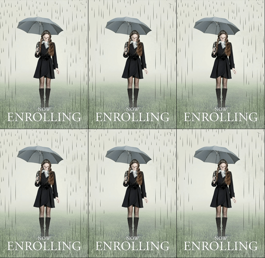
Things are moving. In 2019 designers have to be more cognizant of the fact that things that were once static are now moving. This is not to say that a graphic designer has to now go out and get a degree in animation but it is important to begin thinking about what elements can move and what elements can stay static. This is very popular in creating cinemagraphs and gifs. Small animations will help the viewers to better engage with what you are promoting.
As a designer you have to begin thinking about how your designs are going to work in the moving world.
NATURAL LOOKING PHOTOGRAPHY
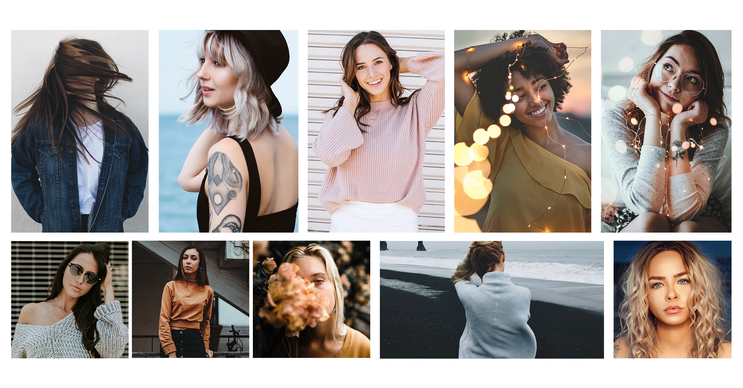
Brands want to feel more authentic. This push into the more real and genuine will be seen in the type of stock photos that are used this year. Stock photos have a tendency to look too professional, polished and vague. In their quest to reach as many people as possible, these photographers choose a safe subject.
Overly edited photos are also out this year, people really want photos they could’ve taken themselves. The viewer should be able to see themselves reflected in the image.
Free sites like unsplash are a great resource for this type of photography.
Just to sum up everything we’ve covered here, in 2019 we’ll be seeing a lot of open composition designs that tap into the viewer’s imagination. Designs with chaotic strokes, stains of color, and shapes to create an artsy looking offbeat pieces. Vivid “futuristic” color schemes and bold gradients to create mesmerizing out-of-this-world designs. Typography will be huge and quite often – outlined. We’ll be seeing art in its most unconventional forms and shapes, and of course, a combination of all of these trends with natural photography, will please the eyes in 2019 and give your designs and marketing campaigns the boost that they need.
What do you think about these graphic design trends for 2019? Feel free to leave your thoughts in the comments below.
Remember, when you hire Oozle Media to fill your digital marketing needs, you gain access to our graphic designers who can create custom artwork that keeps your brand current and competitive in your marketplace. You can contact us anytime online, or call us at 877-986-6529.

Great article, Oozle!